UK Giving 2012: why I think we are right… but hope we are wrong
Posted: November 13, 2012 Filed under: blog post 1 Comment »Blog post by Karl Wilding, Head of Policy and Research at NCVO
It’s one of the truisms of social research that there are no ‘new’ findings. And that if you do find something new, or surprising, the answer is almost certainly that it’s wrong. So, the news that we’re estimating a 15% fall in the total value of donations – 20% if we add a dash of inflation – has made me and a number of colleagues reach for the fine-tooth comb in order to be sure – really sure – that we haven’t made any mistakes. So, why do I think we are right in what we are reporting?
- It’s properly done. The survey uses a random probability sample, selected from a population of all British adults. It’s not a quota sample (used in most surveys these days). The survey uses face to face interviews. It’s not one of those cheap and cheerful web surveys. And it’s over three different fieldwork periods over the year – not a one off. Our numbers have confidence intervals. And this is undertaken by Britain’s Office for National Statistics. And you can find - and replicate - the methodology.
- We haven’t changed the methodology. I’ve been involved in this work for more years than I care to remember and on any number of occasions we have been accused of being wrong. Most frequently the suggestions have been that the survey over-estimates how much people give. My argument is that if we are wrong – we are consistently wrong – the implication being that the trend is correct.
- The economic environment in 2011/12 was poor: and any number of measures of consumer confidence were dipping. The particularly important statistic here is Net National Income per Head (NNI) – considered to be the best guide to real living standards. This held up in the early stages of the recession but has continued to drop as a result of the squeeze on family budgets from rising prices. NNI per head fell by 13.2% between the first three months of 2008 – when the economy peaked – and the second quarter of 2012. Over the same period, GDP per head fell by 7%.). It’s also worth noting that studies such as Donations Foresight and The State of Donation have used econometric analysis to demonstrate a link between economic indicators such as house prices and unemployment and giving to charity. I’ll leave you to guess the correlation and direction of causation.
- Were donors in 2010/11 intending to give less in the future? There’s evidence that suggests charitable giving is a lagging indicator: that is, there is a delayed reaction to economic duress, donors wishing to carry on being generous for as long as they can. This pollfor Charity Insight, in September 2011, found that two thirds of respondents planned to give at the same level in future – but that over a quarter planned to give less.
- UK Giving – a survey of donors - has generally tracked what charities report. A criticism surveys of on what donors say that they give is that they lie: and instead its far better to report what the recipients actually receive (as NCVO does, in its Civil Society Almanac). Our experience is both measures are useful and that trends are important: but they’ll never match up exactly, as I explained in this briefing a few years ago.
- Even some of the big charities are reporting falls in giving. We all know – I hope – that fundraising works. There is irrefutable evidence that the charities that spend more on fundraising get people to give more. So I’d be amazed if we get many of the big fundraising charities telling us that in cash terms donations have fallen 15% (charity accounts don’t adjust for inflation). But some – albeit not many - are beginning to report falls. I’ve spoken to a number of fundraisers prior to publication, all off record. Every one of them is telling me it is getting harder than ever.
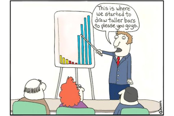
I hope I’m wrong. I hope the fall in donations isn’t as bad as our evidence suggests. And it is possible we are wrong: these are, after all, estimates. I’d like to end on an optimistic note. This is one set of estimates, a point on a line. And just as one swallow doesn’t make a summer, so one data point doesn’t make a trend. And, finally, evidence from past recessions has been that giving recovers. Fundraisers are innovative. And a trend is a trend is a trend. Until it bends.


Much respect to NCVO for an excellent track record of delivering robust research. Karl in this instance I do hope you are wrong although that would surprise me.
But more to the point surely this campaign already exists? I am concerned to see NCVO and CAF investing resources in replicating a campaign which already exists! Just shy of 10,000 pledges from the generous British public as part of the Give More movement at http://www.givemore.org.uk. These are thousands of individuals already giving to charity, who have got the Give More message (check out the John Lewis advertising for starters) and are passionate about their role in supporting charities at a time when charities and society at large need it most. Where is the joined up thinking?